Analytics
Overview
Excenit RSS includes a ready-to-use analytic tool to help you gain insights into your data. This manual only describes the built-in tools. Consult specialized manual for your institution if you have a customized analytics solution.
Analyze Data using Dynamic Pivot
Dynamic analyses are most relevant on annexes that have multiple records, i.e., not summary data. Examples include MAFI 100, 200, 900, etc.
To analyze a return:
-
Open the return in edit mode and navigate to the annex.
-
Switch to the Summary & Interactive Analysis tab.
-
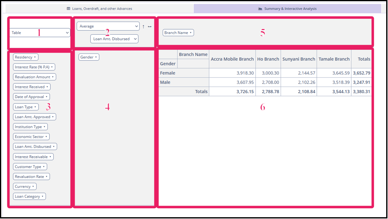
There are several types of charts available (Box 1) and analyses (Box 2). Select the type of chart (table, barchart, heatmap, etc.) and the type of analyses, including sum, average, sum over sum, etc.
-
Select the variables for the analyses. The variables correspond to columns, are listed in Box 2.
-
Select the summary variables from Box 3 and place them in either Box 4 or Box 5 depending on how you want the chart displayed. You can always switch column and rows using the arrows in Box 2.
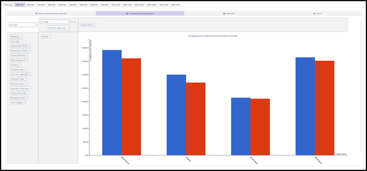
Suppose we are interested in the average Loan Amt. Disbursed (from MAFI 100), and we want to group the data by branch and gender using a bar chart.
-
Select
Bar Chartfrom Box 1. -
Select
Averageas the summary function in Box 2. -
Drag
Genderfrom Box 3 into Box 4. -
Drag
Branch Nameto Box 5. -
Drag the variables into Box 4 or Box 5 depending on how you want to data to be displayed. In this example, we want the
Branch Nameon the x-axis and the averageLoan Amt. Disbursedon the y-axis. So, we will place theGenderfield in Box 4 andBranch Namein Box 5. -
Select the variable of interest,
Loan Amt. Disbursedfrom Box 2 below the analysis dropdown. -
The results will be displayed in Box 6.